About that display...
 Heptagen
Posts: 277
Heptagen
Posts: 277
I keep stumbling upon peoples complaints about that tiny display and how the deluge would be perfect with a bigger one and more information on it.
I just really feel the need to express my utter satisfaction with the display, in my opinion it is one of the key features of the unit. You see, when I researched different grooveboxes my head spun with all the facts and details about the different units, so I took a step back, grabbed a piece of paper and wrote down why I wanted to have a groovebox and which functions it should have.
And pretty quickly I realized that the main reason to go dawless was to get away from that damn screen because it totally screws up my creativity. Theres just something about screens that switches my head into a different mode thats pretty useless for creative processes.
As soon as I understood that, the question of which groovebox to pick got a whole lot easier: An MPC One was no option because of its display and menu diving. Same with the Polyend Tracker.
Since having the deluge, making music feels like playing an instrument again, instead of working in an office.
So Synthstrom, take my heartfelt THANK YOU for that tiny display and keep doing what you're doing. You're definitely on the right track and so good at staying true to it.
Feel free to disagree, but lets spread some positivity! ![]()
Comments
I have to agree, totally love the screen, it is completely sufficient for the needs of the machine.
🅽🅾🆅🅸🅲🅴 🅳🅴🅻🆄🅶🅸🅾🅽🅸🆂🆃?
I am 50/50 on this, so I agree on some stuff and disagree on other things related to the screen debate.
I like the fact that Synthstrom attempted to go with a minimal screen like this with pretty good success for a lot of it's features.
I would've preferred a screen with more info and reinforcement for where I am at a moment in time of using it. I think the sequencer aspect of the Deluge doesn't necessarily need a screen, but I still think it would benefit from it. I find the navigation fluid for sequencing, yet when I'm scrolling between steps 1-16, 17-32, etc. up to step 64 or 128, I find that I can get a little lost. Most of the functions are fairly straight forward for the sequencer and the provided screen is fine.
I think the Deluge could benefit from a screen when editing synth/sample parameters. Because of this, I choose to use my Deluge for it's sequencing, which imo is it's strength. With that said, I just bought a Deluge overlay from Oversynth and that would probably help me out with all the functions of the synth. The overlay is very convoluted and not so nice to look at, but I think it should help with some workflow related things.
The key is about workflow. The Deluge has a pretty nice workflow, but a little bigger of a screen with more info on it would've been nice. I equate the lack of a more informative screen to looking at person with a face mask on. You can get an idea of who they are by looking at their eyes, but you don't really know who they are like you would if they had no mask on. A 4 digit LED screen gives you an idea, but many times you are left guessing where you are in the system.
At the same time, I don't want to complain or dump on Synthstrom for not creating one with a more informative screen, because I think the Deluge is genius with what they created. But it's almost too genius in a sense. It's the same feeling I get when I want an instrument to do a certain thing well instead of a bunch of things all at one time, because it can muddy up the workflow of other functions.
If the D didn’t have a screen at launch, it’d still be great (there’s a ton of functionality that a screen is not strictly necessary for). If they added the screen that’s in there now in a hardware revision, ppl would be over the moon to have it.
That’s how I prefer to think about it.
If there ever gonna be a Deluge MK2 I would vote for this screen :
:
🅽🅾🆅🅸🅲🅴 🅳🅴🅻🆄🅶🅸🅾🅽🅸🆂🆃?
People forget that the keypad acts as a second screen.
I sometimes wish the screen had more than 4 characters, and perhaps more segments per character as @volsteh mentioned. Would be helpful for file browsing, and perhaps show what is being edited as well as its current value in various contexts (e.g. which synth parameter you're editing, or the synth name as well as the number of repeats when you press the audition pad in song mode). Never really find myself wishing for a full pixel-based display though.
Keeps popping up on my FB feed. New screen idea?
~ Distinguished Delugate ᕕ( ◎_◎)ᕗ
I also like the small screen without too much info. Well, volsteh's screen suggestion would be an improvement but I'm slowly learning to read this strange viking rune alphabet.
But what kind of irritates me that when browsing through songs, the screen displays the END of the name, this kind of forces me to use 3-4 character names for everything so that I can find stuff quickly. Should display the start and then if you stayed in place maybe scroll to name back and forth. But that's a first world problem, really.
"Since having the deluge, making music feels like playing an instrument again, instead of working in an office." And yes, this! Coming from Octatrack/Rytm combo it feels that Deluge's workflow supports experimentation and creativity so much better. And OT/Rytm have small screens but you were always a bit lost there also which pattern page you were on and what instrument you were tweaking and so on, can't really say it was more informative.
You can move the portion of text showed on the screen the with LR knob. Think what is happening is you browse trough same song versions so it jumps on the end of the name to show the version. Browsing with shift should skip the versions.
🅽🅾🆅🅸🅲🅴 🅳🅴🅻🆄🅶🅸🅾🅽🅸🆂🆃?
Correct!
~ Distinguished Delugate ᕕ( ◎_◎)ᕗ
I love the workflow as is. I stare at screens all day already.
Ha. I get this ad too.
I knew about that LR knob, but yeah, actually all my longer names have versions, it seems that this was the case. (And all my first songs end up with "test" which makes identification even harder ). When there are no version it displays the name from start. Deluge wins again!
I often get frustrated when I'm trying to quickly find/read patch names, if they're longer scrolling type.....
Frankly, when I'm trying to scroll through a couple of hundred slots to find a specific patch, it's a real pain in the ass, but I still LOVE my Deluge.
I wrote a bunch of stuff but really what I was trying to say is basically what you've written so +1 from me.
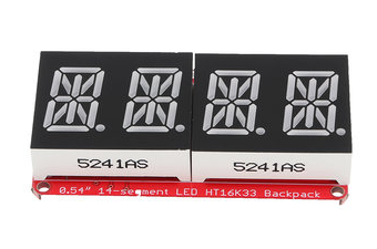
I'd take the screen with 16-seg displays, maybe 16-20 chars wide, just for selecting patch names. But then you'd have to remove the gold knobs and FX buttons, so that's a no-go: the gold knobs are worth their weight in gold.
Once you're in the right sub-directory, though, for instance selecting one bass drum out of your collection, I actually like being forced to use my ears. In fact, I'll usually close my eyes and turn the select knob by feel. This one, or that one four samples ago? Compare, compare, decide.
I kinda wish there was a way to set the screen to start scrolling faster so that I could speed read the longer patch names.
Other than that, I really don’t mind the limited screen. You’re right, I use hardware to escape screens!
My wishlist for the screen in the next hardware iteration of the Deluge would be to have access to 8 characters instead of four, so the names of Synths/Kits/etc., could be more quickly identified.
That and the 14-segment LED display type as shown by @volsteh
Feature requests are on vacation, but there were some old ones about maybe reflecting the folder structure onto the grid somehow. That would be the "delugian" way to do it.")
The nice thing about the limited screen is that it forced Rohan to think harder, and he came up with a better solution. The way you select parameters for synth programming from the grid is absolutely inspired. On (nearly) every other synth, you have do menu-dive into the mod matrix. Here, press LPF cutoff, press envelope, dial in amount. Beautiful and fast, and given that modulations like that are the heart and soul of a patch, it's super important.
On the topic: make sure your folder names are unique / descriptive in the first four letters. Synt / Drum / Kit / Samp / FX / Atmo / Mult / etc.
we don’t need bigger screen but at least a real screen where we can read more than this cryptic one wich is just a joke when you look for files.
We all have to be honest, of course the pads is like a screen but a very low resolution one, useless when you look into hundreds of différents sound files.
I love my deluge and will love even more V2.
I have no idea what is the limitation, I love segment screen, but on my old calculator .
This deluge is fun but it is also quite serious, and the screen should not be a limitation.
Well, originally I opened this thread to set something against the constant nagging about the display but it's always on the verge of derailing and I guess here we go again.
I don't get why people keep talking about and hoping for a deluge 2: synthstrom has repeatedly stated that they are not planning to nor interested in making a different hardware version. And honestly that's one of the many reasons to love them even more. I invested in this piece of gear knowing that it won't be devalued by some unnecessary hardware iteration, like every other manufacturer does. Not only the unit that I hold in my hands but also the very concept of the deluge are both built to last for a long long time and that is the change I want to see in this world.
To anyone having strong feelings against the 4 digit display, let me gently point you to the concept of creative limitation. There are some beautiful things to learn about yourself when being confronted with limits and one of the worst things ever happening to me creatively is the limitlessness of music production on a computer.
+1 That's what I'm talking about. Rohan has found some amazing ways to solve workflow problems. His solutions are so nice, it would've been an absolute shame if he never had to look for and develop them, had he designed the hardware to work the traditional way. It's not always the path everyone takes that is necessarily the best. And he proved it.") Like a keyboard mode for kits or showing folders and files as an overview. But not because I hate using the display, but because it fits the philosophy of the deluge so well.
Like a keyboard mode for kits or showing folders and files as an overview. But not because I hate using the display, but because it fits the philosophy of the deluge so well.
I'm in for every new usecase of the grid for displaying various information - the delugian way
I for one not only love the deluge despite it's display, but all the more because of it. It has character. It's confident. It's fun. What's not to love about that.
Soundcloud | YouTube | bandcamp | Buy me a coffee (:
This is a help but falls short for multiple dimensions, e.g. where do you store your foley kick drum samples?. That's why tags were inventend. Yes it's a good idea but not perfect.
Word up")
")
")
~ Distinguished Delugate ᕕ( ◎_◎)ᕗ
Definitely
This one would actually be pretty "easy" for the determined hardware hacker. Mapping between four characters on 7-segs and four on a 16-seg is one-to-one, right?
Desolder the pins, add in an Arduino / microcontroller-of-choice between the 7-seg outputs and the 16-seg digits, program in the right lookup table, and you're done.
All the other screen ideas require serious firmware changes. This one, at least, only voids your warranty.")
Or you could just learn the Deluge alphabet.
I love too my deluge but you have to realized that the principal discussion all around the world is about the lack of real screen.
There is nothing creative in getting lost looking for his own files due to a lack of clear screen.
I understand your point of view about value but if you love it there is no reason to sold your V1.
I understand Synthstrom who choose to invest in soft instead of hard and I mesure all the good reason behind .
But my point is to reassure them : there is a bunch of V1 owner who will embrace an upgrade version.
I wouldn't want to change the pad based editing, much less replace that with menu diving. But there is room for improvement, and its name is "a screen."
I mean, let's be real. The printed text by each pad is much smaller than my decrepit old eyesight can deal with. So what if, upon pressing a button, the associated parameter's name legibly appeared in front of me? Same workflow, improved visual feedback. I feel like that would increase my speed and confidence. Don't you?
Sure, maybe not having a screen lead to stronger design decisions. But you have to know a screen wouldn't unmake those.
I totally hear you. My eyesight isn't great (the small text on the screen on the Hydrasynth was one of the reasons I sold mine). Programming the Deluge can be a real pain, because like you, I have a hard time reading the small type indicating parameters - and just forget about trying to do it in a live context, under concert lighting conditions.
I realize that people like a break from looking at screens all the time, but reading small text is much worse.
I know that this will probably never be changed on the Deluge, so I try to work with what I have, however there is no question that it would be a substantial improvement. If I were involved in the company, I'd suggest an 'alternate model', a version for the majority of us who need more visual feedback. If there were 2 versions, sales would indicate customers preference, and I think the company would be surprised at the demand.....