OLED Text Kerning Fix
 reza
los angelesModerator, Beta Tester Posts: 767
reza
los angelesModerator, Beta Tester Posts: 767
I've noticed that the OLED text has odd/irregular spacing between certain letters/numbers. I believe this is only for the the larger text displayed in titles and the bold synth/drum kit patch names. It would be nice if eventually everything was evenly spaced properly.
Most obvious issue is the letter i. I think theres meant to be 1 pixel of space between the bold letters. Because the i doesn't have horizontal lines at the top or bottom, the gap between i and other letters is a lot larger. Oddly enough, notice how there is a bigger gap between D and I than there is between I and O. Additionally, since the letter 'A' is wider, using 9px across rather than 7px, there is only 1px between A and U.
Maybe the gap between text should always be 1px (2px?) for the farthest pixel of that letter?
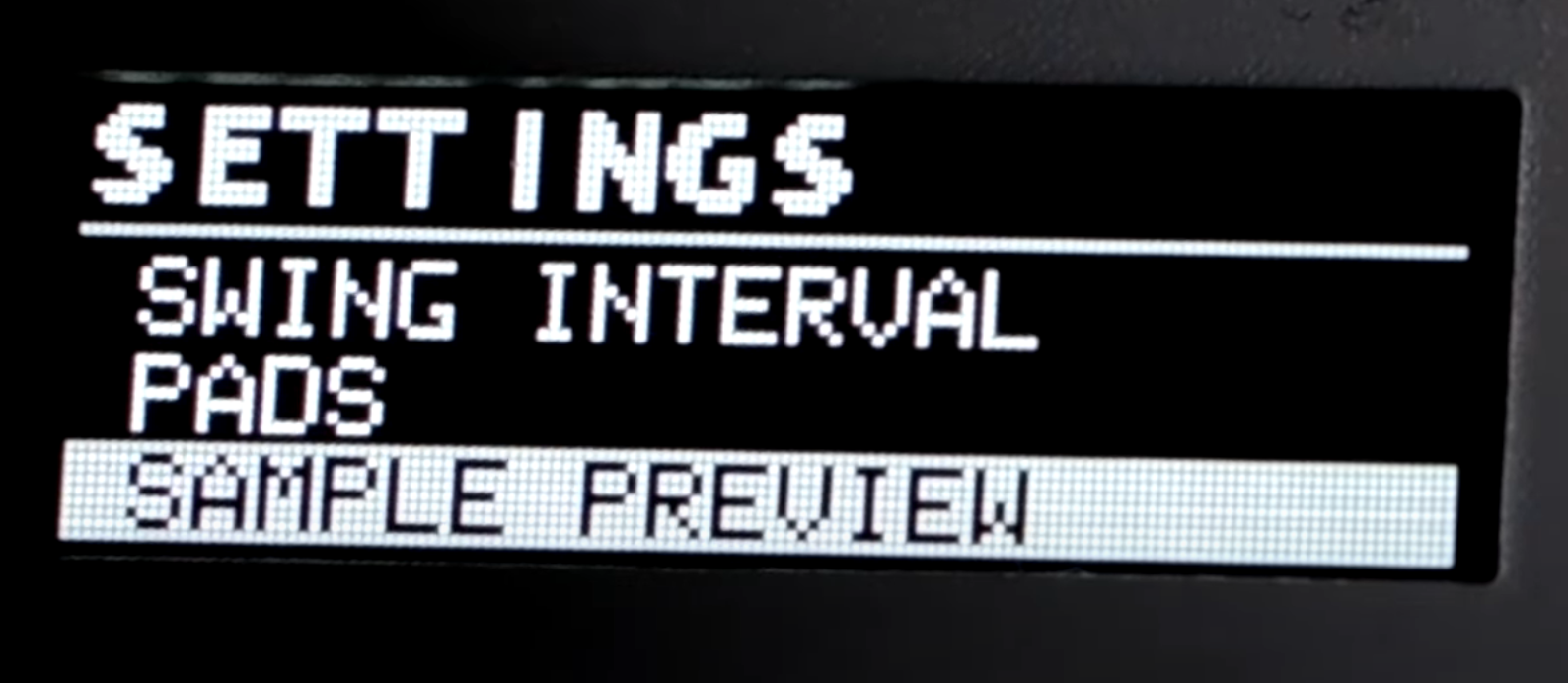
In the second image you can see a larger gap between S and E, and between T, I and N. Starts to look like S ETT I NGS instead of SETTINGS.
See image: 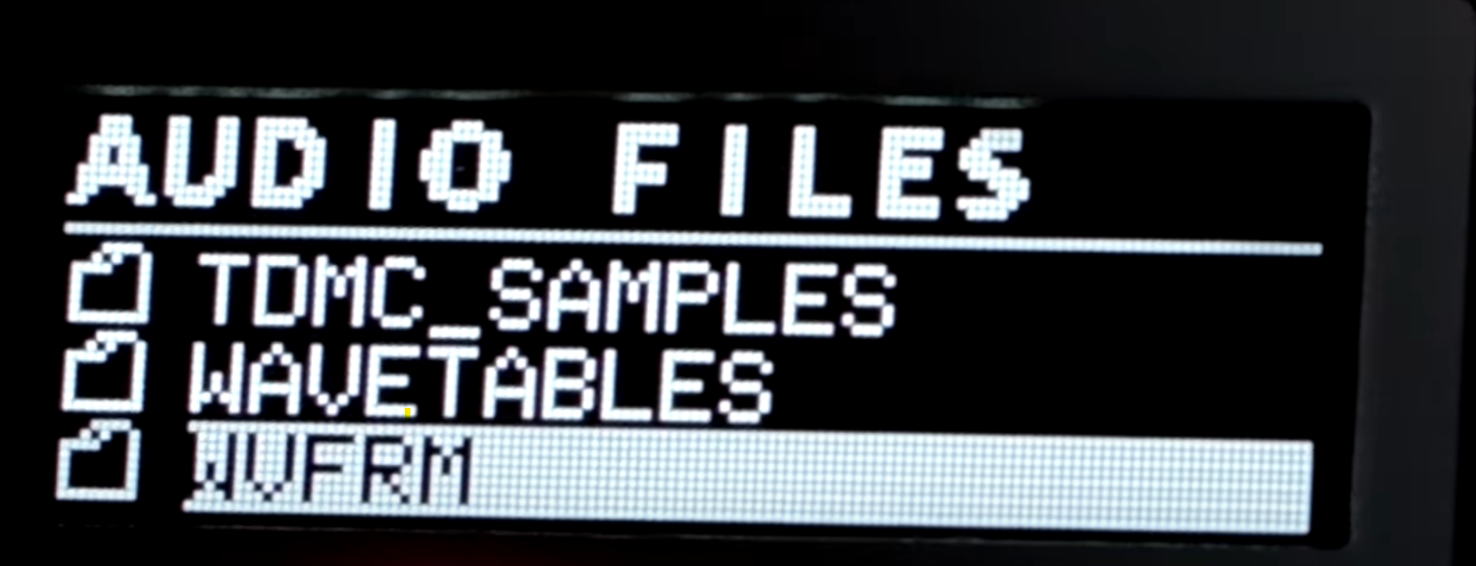
Comments
Did some digging in (src/drivers/All_CPUs/oled_low_level_all_cpus/fonts.c)
Rohan used the following website to generate a given font into a C array: https://lvgl.io/tools/font_conv_v5_3
I had a go at recreating the 'metric_bold_9px' (this is the font/size that shows weird kerning) output that Rohan got. By doing that I found that the generator sometimes would add blank spaces to the left, right, or both directions of a given letter, presumably because if the text was aliased (instead of 1 bit), information would show up in those blank areas.
So it seems like if you manually delete those spaces the problem would mostly be fixed. That being said, I think code in some other location gives the letter 'i' an additional pixel of space around either side, wasn't able to find where that would be.
Additionally, after deleting the blank rows (text is stored in arrays turn 90 degrees) for each character needed, you would ALSO have to update the width of that particular letter (.w_px), and it seems like the .glyph_index number would have to be changed as well (both values appear at the end of a particular font/size's group of arrays). If this wasn't done I think text would get scrambled and not be aligned properly.
I'm not a programmer (and I don't have an OLED lol) so I can't be certain if this is the extent of making the fix. I did find a location where the max # of characters for this font across the screen is set to 14 or 15, there's a chance that could be increased, but it's probably a safe bet to keep it the same.